![[*]](foot_motif.gif)
Audris Mockus
.
CR Categories and Subject Descriptors: I.3.6 [Computer Graphics]: Methodology and Techniques -- Interaction Techniques.
C Additional Keywords: exploratory analysis, navigation, aggregation
Copyright (c) 1993 by the Institute of Electrical and Electronics Engineers.
Personal use of this material is permitted. However, permission to reprint/republish this material for advertising or promotional purposes or for creating new collective works for resale or redistribution to servers or lists, or to reuse any copyrighted component of this work in other works must be obtained from the IEEE.
A data set may have a number of different interpretations when displayed at different aggregations or resolutions. Time series and geographic maps are the most prominent examples. Smoothing is a similar technique that changes the appearance of data, but without the change of resolution. Data are often reported aggregated because of the resolution or design limitations of recording devices, storage issues, or confidentiality issues in, for example, census and disease data. Exploratory aggregation techniques help understand how aggregation affects the displays of data and help select the most appropriate aggregation for each particular problem.
In practice a single resolution or smoothness level is selected and used to display the data. This approach is suitable to convey a particular message. In exploratory analysis it is important to inspect multiple resolution and smoothness levels. A non-interactive iteration over smoothness levels is explored in [6]. A technique to show all smoothness levels simultaneously in a single plot is described in [2]. Work on an interface for exploratory analysis has beginnings in [3]. Recent work on exploratory navigation in multi-dimensional spaces includes [4] and [5].
This work addresses the problem of highly interactive (with response time under 1/10th of a second) aggregation and interpolation of two-dimensional data. One part of the aggregation task involves choosing a family of subsets of the dataset under investigation. The interactive selection of a single subset is addressed by dynamic query (DQ) filters (see, e.g., [1]). The selection in DQ is implemented as manipulation of range sliders on individual variables. Unfortunately, selection or animation over the subsets of two variables simultaneously cannot be accomplished using DQ approach.
Aggregation methods are discussed in [7]. The aggregation widget introduced there allows different ways to partition the data but is awkward for changing sizes or boundaries of the partition. The Aggregation Eye interface described in this work is designed to allow interactive and continuous change to those aggregation parameters.
The aggregation space concept is introduced in Section 2 and defined in Section 3. The navigation interface is described in Section 4. An example of US Census family income data is used to illustrate advantages of the approach in Section 5.
For simplicity, lets consider aggregations over one dimension --
time, for example. The data is represented by k observations
![]() of unknown function f at time moments
of unknown function f at time moments
![]() .
Suppose we are interested in the value of the
function f at some time t. To reduce the noise (in case
observations involve noise) we might represent the value of f(t)as an average of observations close to the time moment t, i.e.,
.
Suppose we are interested in the value of the
function f at some time t. To reduce the noise (in case
observations involve noise) we might represent the value of f(t)as an average of observations close to the time moment t, i.e.,
![]() .
The value
.
The value
![]() would be an aggregation of those observations
would be an aggregation of those observations
![]() that are close to t. The size of the aggregation
neighborhood is defined by the parameter
that are close to t. The size of the aggregation
neighborhood is defined by the parameter ![]() and the method
used to perform the aggregation is unweighted average. If we want to
put more weight on observations in close proximity to t a
different aggregation method would be more appropriate, for example
a weighted average method:
and the method
used to perform the aggregation is unweighted average. If we want to
put more weight on observations in close proximity to t a
different aggregation method would be more appropriate, for example
a weighted average method:
![]() .
As we can see the parameters of the aggregation space are the
neighborhood specified by location t and size
.
As we can see the parameters of the aggregation space are the
neighborhood specified by location t and size ![]() and the
aggregation method.
and the
aggregation method.
In visualization applications we would often want to display the
entire series. To accomplish this task the single neighborhood is
used to generate the family of neighborhoods. The aggregated time
series would then simply be:
![]() .
.
The following discussion considers a general case of the two-dimensional
aggregation more precisely. The aggregations are performed on
observed functions
![]() (R1 is the space of real
numbers) defined on a data space S. The data space S has two
dimensions and two distances d1,d2are defined so that for any element
(R1 is the space of real
numbers) defined on a data space S. The data space S has two
dimensions and two distances d1,d2are defined so that for any element
![]() and a real vector
and a real vector
![]() a
a
![]() neighborhood of x0is specified by
neighborhood of x0is specified by
![]() .
The aggregation of
an observed function f is defined as the mapping
.
The aggregation of
an observed function f is defined as the mapping
![]() or
or
![]() since
N is a function of x0 and
since
N is a function of x0 and
![]() .
.
Given the space S and the neighborhood structure N the
aggregations A differ only in the way they combine a set of values
![]() into a single scalar value. In other words, they use
different aggregation methods. Examples of aggregation methods
are averages, quantiles, and variances. In those examples each value
in the set f(N) is taken with equal weight. To obtain interpolation
or smoothing, different weights must be used (weights usually decrease
with the distance from the neighborhood center x0).
into a single scalar value. In other words, they use
different aggregation methods. Examples of aggregation methods
are averages, quantiles, and variances. In those examples each value
in the set f(N) is taken with equal weight. To obtain interpolation
or smoothing, different weights must be used (weights usually decrease
with the distance from the neighborhood center x0).
In summary, there are three choices that define a location within
the aggregation space: the aggregation method (A), the size of the
aggregation neighborhood (
![]() ), and the center of the
aggregation neighborhood (x0). The user controls those three
parameters via the navigation interface Aggregation Eye.
), and the center of the
aggregation neighborhood (x0). The user controls those three
parameters via the navigation interface Aggregation Eye.
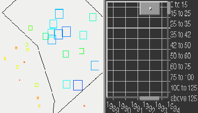
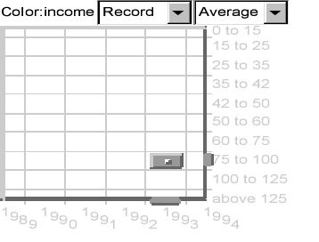
The Aggregation Eye has three components -- animation menus, aggregation menus, and the Eye widget.
The Eye widget (it looks like a rectangular eye) contains two
rectangles, one enclosed within another (see Figure 1).
The outer rectangle represents the the set of all locations within
the two-dimensional data space S and has a labeled grid to
indicate the coordinates. The inner rectangle (iris) represents the
currently selected location x (corresponding to the bright spot in
the center of the iris) within the data space. The width of the
inner rectangle represents the first aggregation parameter
![]() and the height represents the second parameter
and the height represents the second parameter
![]() .
The area covered by the iris represents the aggregation
neighborhood N.
.
The area covered by the iris represents the aggregation
neighborhood N.
Figure 1 shows two example configurations of the Aggregation Eye. There are six years and 10 variables (income levels; for details see example below) in the example data. The graphical attribute ``color'' and the title of the dataset ``income'' are at the top left, the menu of animation options is at the top center, and the menu of aggregation methods is at the top right of each plot.
Dragging the center of the iris with the mouse changes the
aggregation location x. Dragging the mouse with the shift key
pressed resizes (zooms) the iris and changes the size of aggregation
neighborhood
![]() .
.
Dragging the affordances in the label areas provides movement of the iris along the corresponding axis. This helps in making precise comparisons by changing only one dimension. It would be virtually impossible to keep one of the coordinates constant by dragging the iris directly.
Arbitrary mouse interactions with Aggregation Eye may be recorded. The animation menu provides recording and playback functionality for these user-selected trajectories in the aggregation space.
The aggregation menu offers a selection of aggregation methods, including average, minimum, maximum, median, variance, and smoothing functions. The smoothing function uses weights decreasing from the center of the aggregation region and has the property that a small change in the aggregation specification has a correspondingly small effect on the result. This provides smooth animations and continuous feedback during interactive navigation. It also helps the user stay oriented while exploring the aggregation space.

|
|
In the subsequent example the same aggregation is applied simultaneously on a collection of observed functions fj(x) defined on the same data space S. Each function in the examples below corresponds to an individual geographic location where a number of quantities are measured over time. The time periods and quantities make the two dimensions of the data space S.
The values of aggregation for all x along one of the dimensions
S1 of
![]() are displayed in the following examples.
In such cases the aggregation iris defines a family of neighborhoods
along that dimension. More precisely, if
x=(x1,x2) is the
location of the iris center and
are displayed in the following examples.
In such cases the aggregation iris defines a family of neighborhoods
along that dimension. More precisely, if
x=(x1,x2) is the
location of the iris center and
![]() defines the iris
size, the family of aggregation neighborhoods is
defines the iris
size, the family of aggregation neighborhoods is
![]() ,
where x takes all values from S1. The
values to be displayed are
,
where x takes all values from S1. The
values to be displayed are
![]() for all
for all
![]() .
In other words, each neighborhood in the family is defined
by replicating the iris with its center at (x,x2), where xtakes values from S1
.
In other words, each neighborhood in the family is defined
by replicating the iris with its center at (x,x2), where xtakes values from S1
The example uses the MapView [8] display to show the effects of the exploratory aggregation. MapView is an interactive tool for visualizing multivariate-time-space data. It has geographic views with multiple layers of outlines, locations, and regions for geographic reference. The data are mapped to various graphic attributes (e.g., color and size) of iconic representations for each spatial location. MapView has implementations in the C and Java languages. The Java implementation is used in the examples.
The data are derived from the 1990 US census. Estimated 1989 family income and yearly forecasts from 1990 to 1994 are used. The number of families for ten income levels is reported for each postal zip code. We use the percentage of families within the zip code that fall into one of the income levels. The ten income levels (in thousands of US $) are shown in Figure 2. The figure show zip codes in and surrounding Washington, DC. The percentages are rescaled within each income level to enhance the visual effects.
The available data can be represented by a three-dimensional array indexed by the zip code, year, and income interval. The values represent the percent of population within a zip code. The last two dimensions of the array (year and income interval) define the aggregation data space S, while the first dimension (zip code) enumerates observed functions f, each corresponding to a geographic location.
Figure 2 shows two screen dumps of a part of the MapView display with the Aggregation Eye widget. Each rectangle in the view represents a zip code. The size and color of the rectangle corresponds to the percentage of families aggregated over income levels and time moments specified by the Aggregation Eye control. A rainbow color scale with color blue representing high values and color red representing low values is used. The outline of the boundary of Washington, DC is visible as a white line in the background. The aggregation method ``average'' is selected.
The left plot shows average percent of families with income levels above 75 for years 1989 and 1990. The neighborhood defined by the iris covers three income levels (75 to 100, 100 to 125, and above 125) and two years (1989, 1990). Six observations are aggregated by taking average (currently selected aggregation method). The right plot shows average percent of families with income levels below 25 for 1992 and 1993. The neighborhood defined by the iris covers two income levels (0 to 15 and 15 to 25) for years 1992 and 1993.
A large percentage (indicated by large blue rectangles in the left plot) of high income families are located to the south-west of the city, while the city itself has a relatively large percentage of low income families (indicated by large blue rectangles in the right plot).
Figure 3 shows two plots similar to plots in Figure 2. In Figure 3 each zip code is displayed as a small line plot where the income levels are on the horizontal axis (increasing rightward) and the percent of population is represented by the vertical offset (increasing upwards). The center of each line plot corresponds to the geographic center of the zip code. zip codes are colored exactly as in the right plot of Figure 2.
Since all income levels are displayed simultaneously a family of aggregation neighborhoods is used. The family is defined by replicating the iris with its center at each income level. The family of neighborhoods in the left plot corresponds to the reported income levels extending over three years (1989 to 1991). The family of neighborhoods in the right plot covers years 1992 and 1993 and the income intervals are: 0 to 35, 0 to 42, 0 to 50, 15 to 60, 25 to 75, 35 to 100, 42 to 125, above 50, above 60, and above 75.

|

|
The iconic representations of income levels in Figure 3 are jagged on the left plot and smooth on the right plot. The smooth version on the right is more suitable to show the general trends of the relationship between percentages and income levels. The zip codes within the city boundary show decreasing trends corresponding to the fact that most of the families there have low income. The zip codes outside the city show increasing trend indicating relatively large percentage of high-income families.
The aggregated right plot in Figure 3 hides some of the detail that can be easily seen from the left plot. In particular, the fact that the icons to the south-west of the city (in the state of Virginia) have two peaks corresponding to two distinct income levels are not visible in the aggregated plot. The two peaks show the exact mixture of the zip code population in Virginia which is quite different from the mixture in Washington, DC.
The two plots demonstrate how the choice of aggregation can reveal or highlight different features of the underlying data.
The choice of aggregation as an interactive operation in exploratory data analysis has been examined. The space of possible aggregations have been defined and the Aggregation Eye interface to navigate through that space has been designed.
The definitions of the aggregation space include smoothing and interpolation as special cases which are especially useful in animation and other interactive tasks where a smoothly changing display is preferred.
The Aggregation Eye interface is designed to navigate through aggregations of a two-dimensional data space. The interface allows convenient and precise ways to specify and change the aggregation and to perform animations over the aggregation space. The interface can be directly generalized to a 3-dimensional data space if a 3D (instead of the current 2D) widget is used.
The use of the Aggregation Eye on income data from US Census shows a new way to explore complex datasets and demonstrates a simple model-free method to extract and emphasize trends from noisy observations.